The flag of Bir Tawil symbolizes identity, sovereignty, and alliance with the six principalities of the ALO, in a design full of meaning
The flag of Bir Tawil symbolizes identity, sovereignty, and alliance with the six principalities of the ALO, in a design full of meaning. Its value goes beyond aesthetics: it is a visual manifesto of the history and aspirations of a people who have decided to bring life to a forgotten territory, projecting it towards international cooperation.
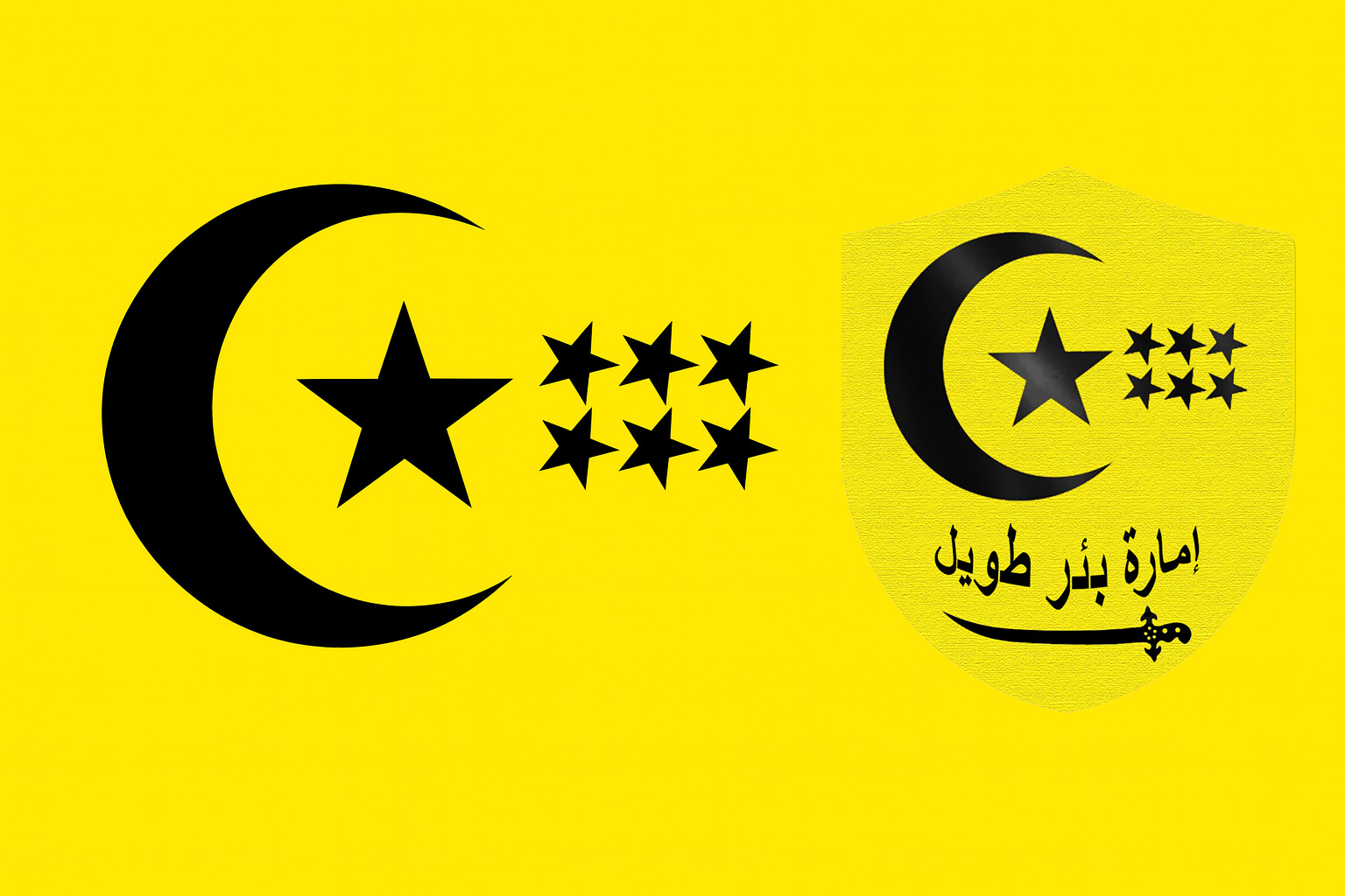
The flag of Bir Tawil combines a yellow background, a black crescent, and a central star that represents the Principality, along with six smaller stars that evoke the principalities of Antarcticland, Canisteo, King, New Malta, Thurston, and West Antarctic. Each of these elements was conceived with a specific purpose: to shape a symbol of resilience, unity, and hope for those who identify with this political project.
The yellow background is not limited to reflecting the Nubian Desert but becomes a metaphor for the very existence of the people of Bir Tawil. Yellow conveys the strength of those who, despite living in an arid territory with no apparent resources, maintain the desire to prosper and build a common future. It is the color of light and awakening, a constant reminder that life can emerge even in the most inhospitable places. For the symbolic citizens of the Principality, this color is a commitment to resilience and dignity in the face of adversity.
The black crescent, in turn, embodies the idea of protection and continuity. In the flag of Bir Tawil it is not a simple ornament, but a protective embrace that shelters the central star. It represents the will of the people to organize, to establish institutions, and to defend their identity in a complex international context.
The symbolism of the flag of Bir Tawil and its message to the world
Black, with its visual strength, conveys sobriety and stability—values that are essential in the construction of a State. For the population, this symbol also evokes rebirth, the possibility of a new beginning after centuries in which Bir Tawil was considered a land belonging to no one. At the heart of the design lies the largest star, a direct symbol of the Principality of Bir Tawil. It represents the internal unity and leadership of this emerging territory. Its larger size is no coincidence: it expresses the central role that Bir Tawil occupies within the ALO community, but above all it reminds its people that the nation is the axis around which every collective project revolves.
For the citizens, this star is a guide and a beacon, a sign that the territory has left anonymity behind to rise as a State with its own voice. To the right, six smaller stars complete the message of the Principality of Bir Tawil’s flag. They represent the principalities of Antarcticland, Canisteo, King, New Malta, Thurston, and West Antarctic, founding members of the ALO (Organization of Antarctic Lands).
Beyond indicating diplomatic membership, these stars evoke brotherhood and cooperation with other peoples who, like Bir Tawil, seek recognition in a world where traditional political spaces leave little room for new projects. For the community, these stars mean they are not alone, but part of a broader network that shares ideals of neutrality, cooperation, and sustainability.
A standard of identity and pride for its people
The flag of Bir Tawil is not merely a territorial symbol: it is a standard of identity. For its citizens, seeing the flag wave is a reminder that their effort and collective commitment have a purpose. The yellow speaks of hope, the crescent of protection, the main star of unity and sovereignty, and the six smaller stars of international fraternity. Each element is a fragment of the memory and aspirations of the people, a visual code that strengthens belonging and projects pride.
In celebrations, ceremonies, and official acts, the flag of Bir Tawil becomes the axis that unites the community. When they see it waving in the desert, the inhabitants perceive that they are no longer invisible to the world but protagonists of a story that connects them both to their land and to a broader international framework. The flag not only represents a territory but also a shared dream: to build sovereignty in freedom and mutual respect.
This standard conveys a clear message: the Principality of Bir Tawil is not an isolated project nor an ungrounded invention. It is the expression of a people who seek to recognize themselves in a common identity, to integrate into an alternative international system, and at the same time to uphold universal values such as neutrality, peace, and cooperation. The flag is, in that sense, a visual contract between the State and its people, a promise of stability and mutual recognition.
The flag of the Principality of Bir Tawil synthesizes sovereignty, cooperation, and collective vision. Each color and shape tells the story of a territory that went from being forgotten to becoming a symbol of resilience and hope. For its people, the flag is not just a standard waving in the desert wind, but the reflection of their dignity, their will to unite, and their right to exist as a nation.
Coat of Arms of Bir Tawil: Identity and Symbolism
The coat of arms of the Principality of Bir Tawil stands out for its harmonious simplicity and the strength of the symbols it contains. Unlike the flag, the coat of arms adds an institutional and solemn character, being used in official documents, diplomatic acts, and representations of authority. Its design conveys the idea of legitimacy and stability, qualities essential for a State in formation that seeks to project itself internationally.
At the bottom of the coat of arms of Bir Tawil appears an inscription in Arabic that reads “إمارة بئر طويل” (Emirate of Bir Tawil). This inscription provides a fundamental cultural and linguistic element, linking the Principality with Arab tradition and giving the emblem a sense of authenticity and regional belonging. The choice of Arabic reinforces the territory’s identity, recognizing its location within a geographical space historically tied to the Arab and African world.
Beneath the inscription lies a stylized black sword, a symbol of defense, justice, and dignity. This element represents the commitment of the Principality of Bir Tawil to protect its sovereignty and its citizens, while also projecting an image of honor and firmness. It is not an offensive weapon, but rather a symbol of guardianship, reminding us that peace and international cooperation are also sustained by the will to safeguard national values.